 We are not accepting new customers at this time, but don't worry! You can
Looking for affordable web design packages? Website design pricing can range from $500 to $20,000 depending which web design company you talk to. Obviously this leads to confusion about how much a website should cost. But don’t let the search for affordable web design send you scouring the web for the cheapest price you can find.
Instead focus on value and maximising the return for your business. We do.
As Australia’s leading WordPress support service we manage hundreds of WordPress websites built by our team and other companies alike. This depth of experience means we understand what really matters and how to achieve it when it comes to website design.
What do Successful Website Designs Have In Common?
There are a number of essential website features, if they are missing it can make the difference between a website that promotes engagement with your audience and a flop that potential customers don’t trust or can’t even find. Any website package should have following included as standard.
The Best WordPress Designs
It’s important that your website reflects your brand perfectly and is irresistible to your customers. We create a customised website design that does both to ensure every client gets maximum value from their online presence.
Responsive Web Design
Whether somebody is viewing your website from their work PC, their iPad at home, or their smart phone on the go, a responsive website ensures that they have a consistent, positive experience.
Social Media Optimisation
Social profile links, and easy social share buttons lift every website design. We make it a priority to integrate social media building trust with your customers and more reach for your content.
WordPress Training
Creating and publishing content is simple and easy with WordPress, we’ll show you how! Once we have completed your website, we’ll hand the reigns over to you in a one on one WordPress Training session.
WordPress Website Hosting
From our years of experience with every local hosting company and many off shore we have the inside knowledge to recommend and get you setup with the best Australian Hosting for WordPress.
Easy Unlimited Updates
Create and publish as much content as you want with absolutely no limits. Website needs changed? We can easily customise and extend the functionality of your website to meet your future needs.
Search Engine Optimised
A great looking website is worth very little if nobody can find it. We will optimise your website with the best SEO plugins, configure your Google Analytics account so that you can get an overview of your traffic at the touch of a button and ensure your website is indexed in Google.
WordPress technical support
When you have your own website, it’s important that you are supported so that you can have access to WordPress technical support at any given time. We include 3 months of WP Copilot membership free, so that you and your website are never alone.
Website Speed Optimisation
People have no patience for slow websites, and will simply move on if your site takes too long to load. Our WordPress developers fix slow websites built by other designers almost daily, so you can be assured we’ll have you running as fast as possible.
Backups & Security
Website security is a top concern for business owners and for good reason. Security hardening for every website includes automatic malware scanning and a website security firewall. For added piece of mind we schedule backups of WordPress core files and databases.
Website Content
We know how important it is for your website content to look just right. Your text and photos are uploaded for you, beautifully formatted and optimised. Don’t have content? No problem, let us know and we’ll organise it for you including quality professional stock images so you don’t need to worry about finding photos.
Website Conversion
Our website packages maximise the conversion of website visitors into customers. Smart designs, callback, subscribe and contact forms, strong CTA’s (calls to action) and Google Maps integration make it easy for customers to access your products and services.
Our WordPress Website Design Packages
Business Website Package
-
The best WordPress website design package for local businesses to generate leads and calls.
- Mobile responsive design
- 15 Pages created for you
- 5 Essential plugins setup for SEO, speed & security optimisation
- Website speed optimised
- Search engine optimised
- Social media integrated
- Google Analytics tracking setup
- 3 months free 1st class WordPress support
- 45 minute WordPress training session
- Enquire Now
eCommerce Website Package
-
The best ecommerce website design package for online stores, subscription services and digital product websites.
- Mobile responsive design
- 15 Pages created for you
- 10 Products added for you
- 5 Essential plugins setup for SEO, speed & security optimisation
- Website speed optimised
- Search engine optimised
- Social media integrated
- Google Analytics tracking setup
- 3 months free 1st class WordPress support
- 45 minute WordPress Training session
- Enquire Now
What are people saying?


Read more of our 5 star reviews on Google.
How Website Packages Work
Working with us to create your perfect website couldn’t be easier. We follow these 5 steps to create a website your clients will love.
1. Planning
Once a booking has been made with a 50% deposit we hold a website planning meeting to set out the design guidelines, goals and website content sitemap. Following this meeting you supply your website content or we create it for you.
2. Design
With the planning phase guidelines and content we get to work designing your new website. Design concepts are supplied and your feedback applied before moving to the build phase.
3. Build
Your website is built from the finalised design concept with a private link to view the progress live. This way we speed up the feedback process and make any final adjustments to get your website launched quickly.
4. Launch
It’s an exciting time when your website goes live. Once the website build is approved and a final 50% payment made we switch your website live within 48 hours. Your then open for online business!
5. Support
Sit back and relax with Australia’s leading WordPress support service. We schedule a WordPress training session and provide access to our WordPress videos and developers among other benefits.
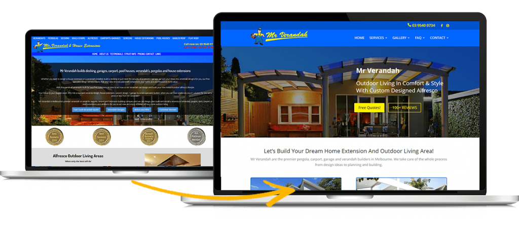
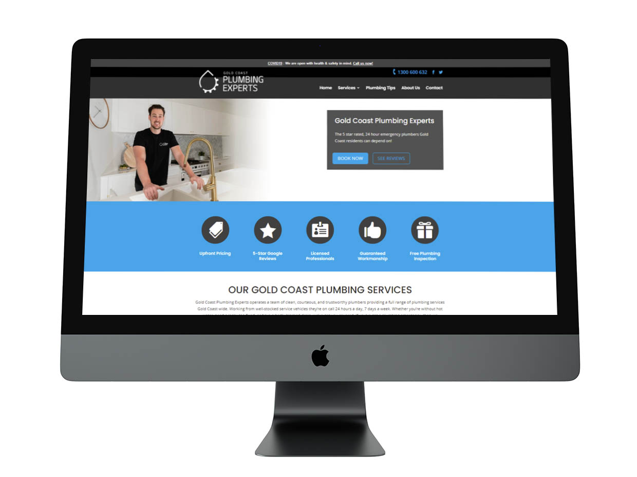
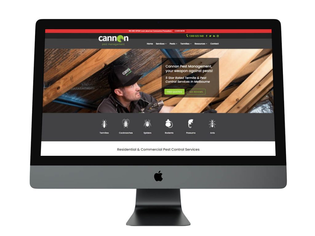
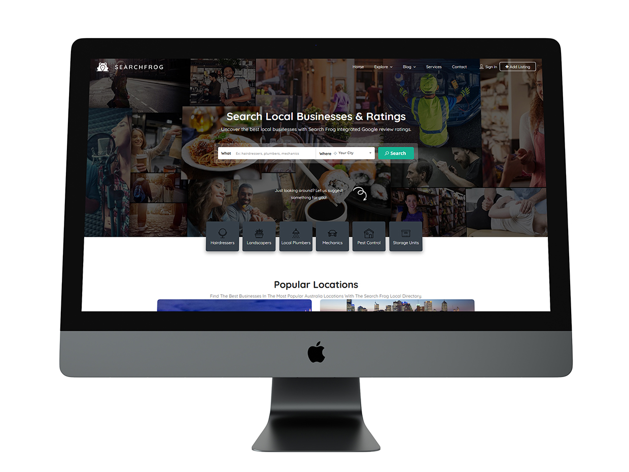
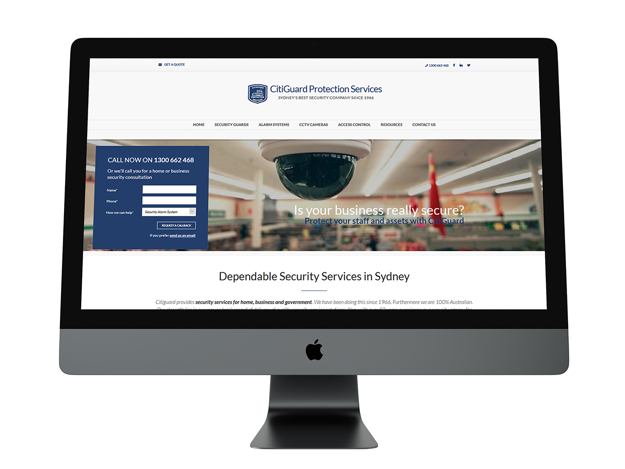
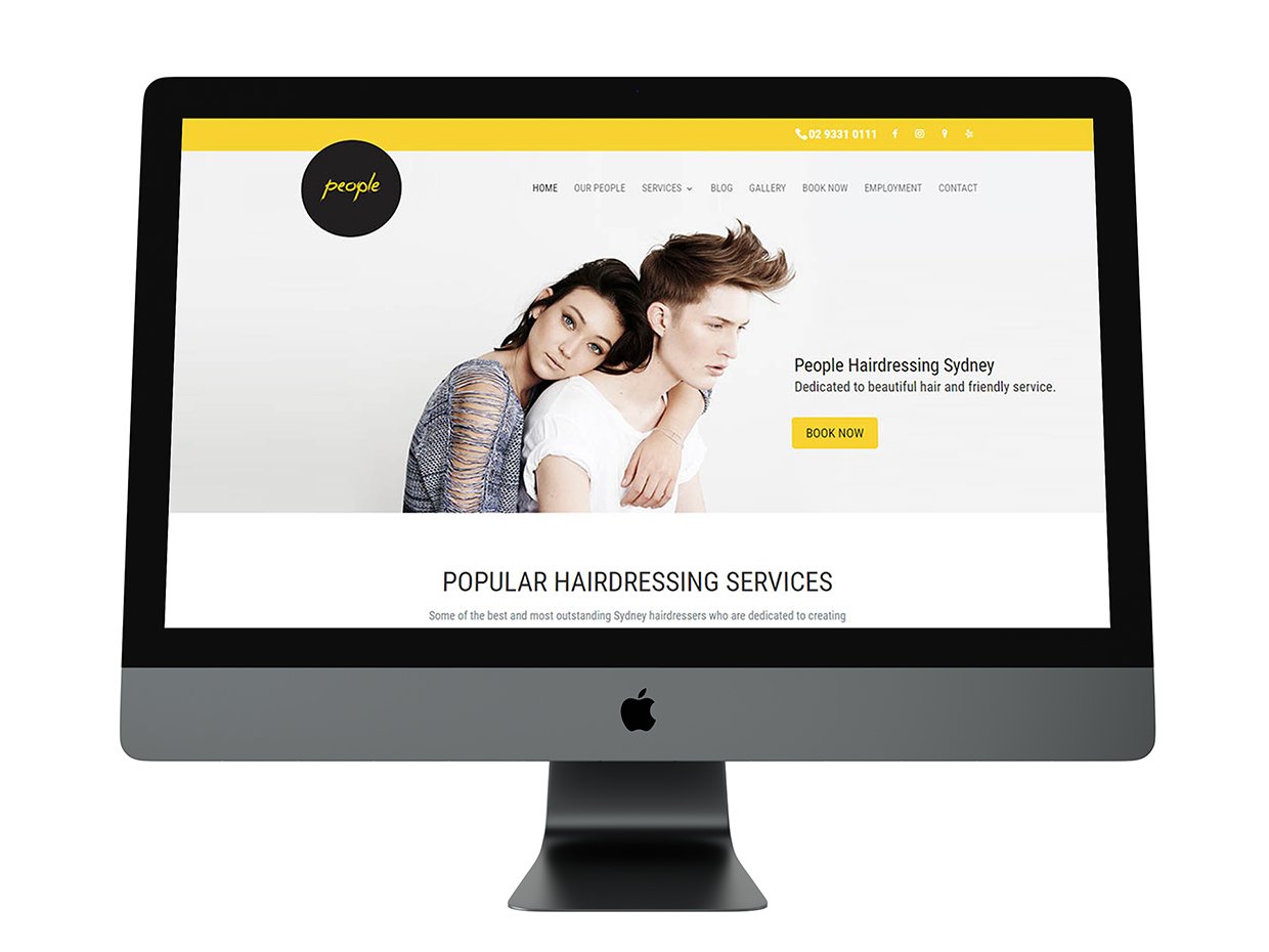
WordPress Website Design Examples
You are just a few clicks away from the perfect website!
Send us some basic information about your website project and any questions you might have. We’ll review your website goals and get in touch within 24hrs for a free consultation.